What makes the best online grocery store website design? Typically, impressive product images and remarkable presentations drive your business. The website allows you to list down and customize the products, save commuting costs and time, and increase sales via marketing tools. Website owners and customers can cash in on the benefits of an eCommerce grocery shop.
What are the top 10 online grocery store website designs?
Research says that 70-75% of people use smartphones to access online services. Moreover, 60-62% of users prefer the website or mobile app. So, a responsive website layout is your goal.
Supermarket efficiency and process management rely on an impressive site layout. Experts pick the ideal online grocery websites for you with essentials and next-gen design outlines. Let’s discuss the
Mantova Food
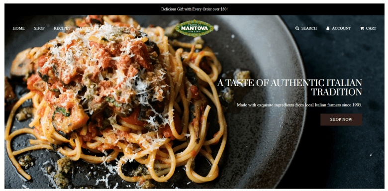
If you need a magnificent pantry website, you cannot avoid an Italian grocery in New York. A flat 10% off gives customers a great push. The responsive design takes out your breath.
Mantova evokes customer trust by mentioning their century-old operations since 1905. Besides, a short clip on the homepage certifies their authentic food item sourcing and farming. You can almost feel the smell and taste.
The sticky navigation bar uplifts your user experience.
Instacart
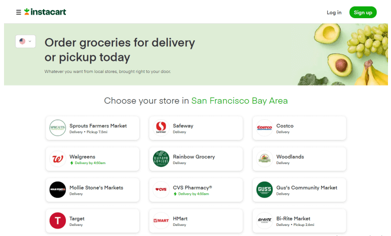
If you are looking for a genuine grocery concept, you must review Instacart.
True naturalness is eminently on display on their homepage. Strategic use of green fonts and background color gives off a farm-fresh feeling. Customers’ eyes get dead set on their extensive business operations across the US and Canada.
Their FAQ section stands prominent. It deals with essential queries. Furthermore, the add-to-cart button helps accelerate their margin.
Shresta Indian Grocery
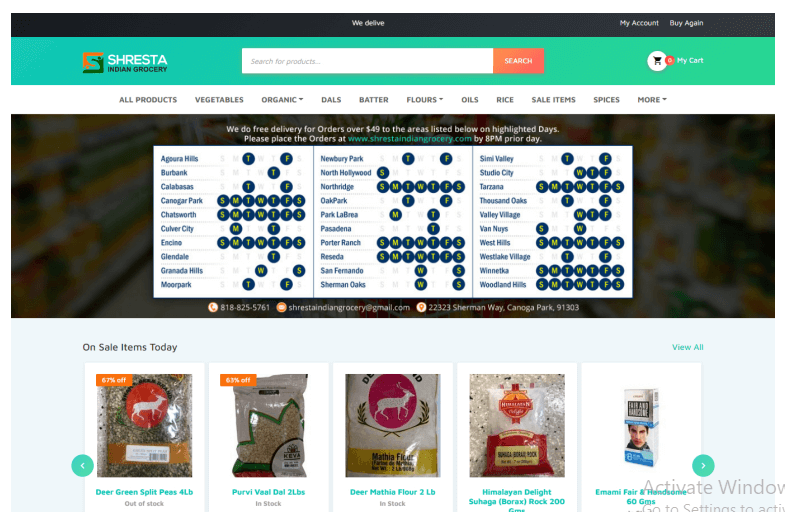
You need to check out this classic online grocery shop layout.
They take you straight to the products and pitch the images with prices. You know the old-school and yet unmistakable business model of informing the customer at the very outset. A small and neat grocery display speaks to your daily necessities.
Purchase in a minute and get out is the motto. So, they put a sticky search bar at the top. Also, a neat contact form expedites customer contact.
Baba G
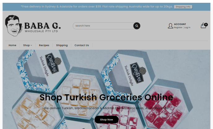
If you need a simple-looking grocery store, you have to explore this halal Australian one. The account registration process definitely hits a sweet spot.
Baba G inspires visitors to become customers by flaunting a 15 percent off at the checkout. Also, the sticky search helps the customers quickly sift through piles of grocery items. The uncomplicated user experience adds value to your shopping experience.
Big Basket
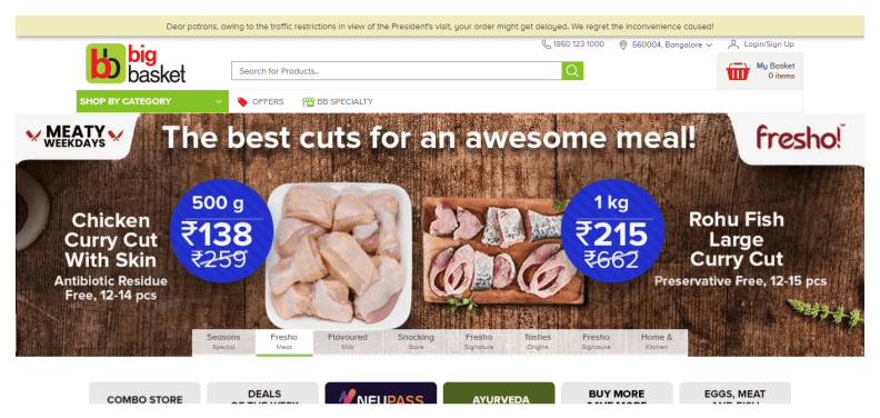
This online grocery shop lights up your soul. The vibrant and versatile food colors tempt your buying spree.
Their whooping 20k+ products range from dairy to fruits and vegetables. Here, 1000+ brands delight several million customers.
In the footer, we notice a host of popular foodstuffs. This list can still clinch a deal when all else fails to convince the customer by using these irresistible provisions.
The Breakfast Pantry

Don’t just go out and about. Let’s dig into a fascinating grocery business. The instant chatbox is a good dealmaker for one and all.
Health benefits tag alongside each item. Talk more about an incredible sales pitch!
Clean website design sets them apart. An eye-soothing layout gives them a great headstart right from the beginning. Visitors can feel their organic product line.
Outstanding images entice you to go for purchase anyway. Unlike other grocery shops, well-classified shopping items stimulate your craving. You expect something new every second you stay on the website.
How to design a grocery store layout?
What makes a good grocery store?
Conclusion–
A mobile-friendly website goes a long way in an eCommerce environment. Several irresistible offers and buttons prompt particular marketing objectives. A smooth display of grocery products streamlines customers’ shopping experience.
They can add items to a shopping list for printing and storing. Also, a quick mail sign-up form is the backbone of a new site. Lastly, do not forget product and content updates. Thus you can have the top online grocery store website design.


