The best real estate website design prompts valuable leads. Hence, the leading real property websites go beyond beauty. It focuses more on effectiveness and powerful website features. So what happens when rigorous usefulness meets delicate beauty?
The Washington Post says, “iBuyers are real estate companies that allow consumers to buy and sell on-demand.” Nexwebit introduces 14 ideal real estate website designs with outstanding visuals, user interface, user experience, color choice, and features. Therefore, you can seal the deal. Now, an advanced realty website is right around the corner.
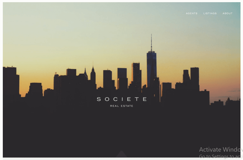
A darkened background distinguishes the Societe Real estate website. Eye soothing visuals guarantee greater engagement and a more extended stay for visitors.
Besides, you can customize the landscape concept. Add new sections with user-friendly builders. You can entice the visitors with the tactical CTA.
The simple heading uses a medium font. Unlike most realty websites, this website directly calls your attention to the lists and agents. So, one can easily explore them.
Your control over the real estate business is telling.
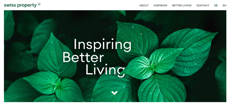
The greenery in the hero banner image advocates an eco-friendly real estate concept. Also, the simple tagline on the homepage claims all your attention in just a second. The visitors browse through in a peaceful state of trance.
Smooth user experience is central to their design. Their target clients love wood-based and high-tech engineering.
A clean footer prompts actions. No hillbilly distracts the audience from the core real estate message. The ready-to-meet expert team is biding time to address customer concerns.
A professional reflection is unmistakable. Also, the prominent contact number and email address bring actionable leads. The best real estate website design cannot get any better.
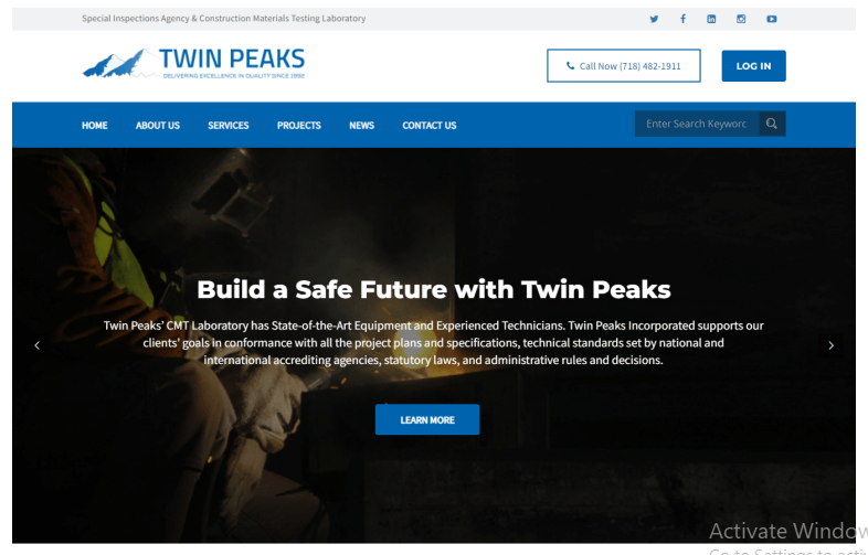
A wonderfully-built website persuades your clients like magic. Twin Peaks Testing notes their license numbers in the footer to demonstrate trust and reliability.
A clean hero banner instantly captures the public eyes. The obvious messaging of leadership echoes reliability in special inspection and gets the visitors in the loop.
The sticky header contains all services, contact points, and projects for reference. A highly distinguished call-to-action button at the top right deserves mention.
Apparently, wider exposure and reach are the targets. The real estate website design immediately gets down to that business. An uncomplicated homepage contains only the essential elements, including services, logo, social icons, etc.
Moreover, strategic photos involve brief details. Hence, the engineering works and the neighborhood menu are handy right down the homepage.
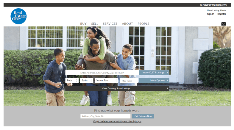
Typically, internet users prefer trustworthy brands. They have built to spread an online reputation. Consequently, their apparent layout exposes their digital marketing efforts, including a new header, prominent listings, etc.
A remarkable real estate website design momentarily engages the audience. It is the top apartment specialist in Michigan.
The homepage shades all sorts of redundancy and sticks to a precise length. Strewn around project descriptions and CTAs give the visitors a good vibe.
The homepage displays specific goals to leverage its local SEO & marketing advantage. So, web components, advanced search, and clean typography bring results. A drop-down chatbox draws visitors into the fold.
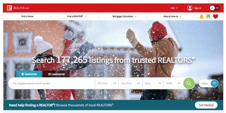
The sky is the limit for the Realtor in crafting the leading realty website in Canada.
Happy couples in the background welcome the audience to the website homepage. The feeling of home is eminent throughout it, thanks to the love symbol equating empty homes on the listing.
Popular architectural and engineering blogs further their content marketing scheme. Besides, you see them operating across popular Canadian cities.
Amazingly, a clean footer contains their Android and iOS applications cashing in more excellent value and public confidence.
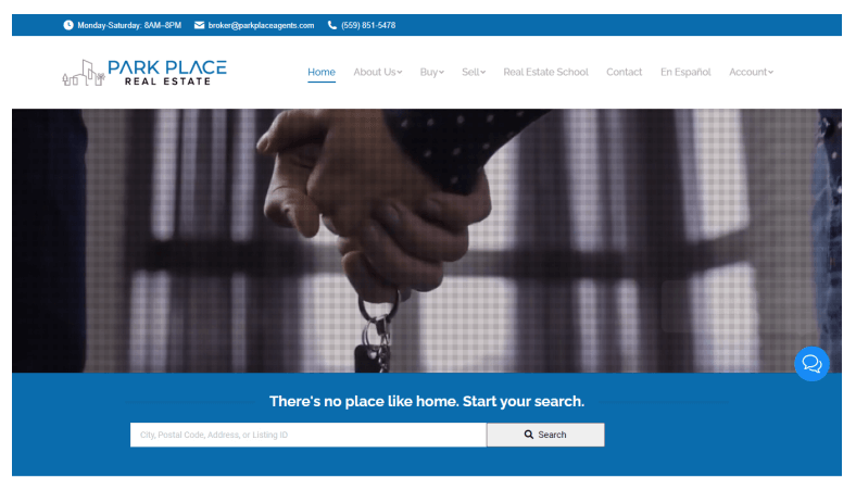
This best real estate website design website aesthetically displays a detailed description of all projects. In the welcoming video, A beautiful family takes you off on a captivating journey inside a palatial apartment. Multilingual accessibility expands their market cap.
Park Place develops a convenient place central to the city’s heart. Therefore, a unique website convinces us of their professionalism. Visitors can explore the technical details, energy efficiency, and build quality.
User-friendly navigation and the off-canvas menu do the tricks. Also, all pages involve a clean and minimal layout.
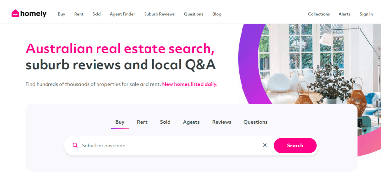
Homely is an Australian real estate venture. A glowing home greets you at the outset. You feel closer to their cause with this glimpse into a dream place.
They maintain a clean above-the-fold content for an uncluttered look. The hero banner adequately describes the core concept of a friendly neighborhood. A simple and piercing headline immediately triggers action.
The search field accelerates your connection with the listings and agents. All your answers appear right at the top, including buy, rent, reviews, and relevant issues.
A strategically placed top search field compels visitors to type. Furthermore, all the buttons at the top take you to the right pages. Hence, the first contentful page gets a clean feel.
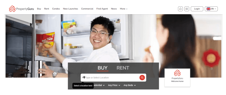
A graceful Singaporean skyline embraces your soul. Capturing leads is the core target.
The clean and straightforward search field instantly claims attention. No distraction hampers the visitor’s focus. So, it prompts the audience to action.
Three sets of real estate collections classify as “latest,” “virtual tours,” and “handpicked.” The visitor must feel appreciated due to the curated list.
Also, Property Guru displays the most updated property market report in a highly conspicuous red box. The blog delivers insights into the current real estate tidbits in Singapore. That’s a superb audience engagement technique.
“Ask Guru” is a killer visitor-involvement tactic. Thus, the visitor can get personalized suggestions while the company approaches them.
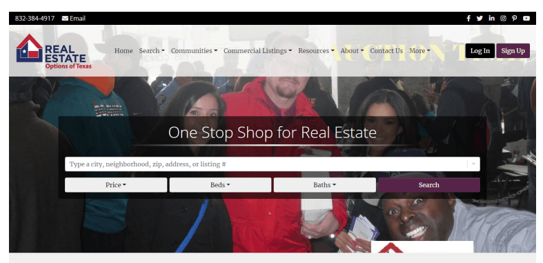
The best real estate website design is all about a luxurious lifestyle. So, real engineering and architectural beauty appeal to elite realty clients.
Here goes an inspiring real estate website design. The Edge is a leading realtor in Florida. Innovative designs mark them out.
See the yellow chatbox button down the right side. The audience resort to warm communication.
Aesthetic and creative project images pair with a detailed description. They outlined a convenient and impressive realty website for the wealthiest visitors. The footer remarkably bakes into the homepage. Interesting, Nah!
Users can explore the technical details, safety, energy efficiency, and build quality by clicking the actionable buttons. Also, user-friendly navigation stands out.
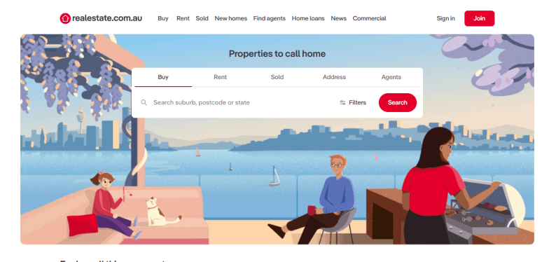
Let’s review a top realty website in Australia.
Tremendous use of black and whitespace is a pleasure to your eyes. It snaps your heart.
Colorful animated images reflect a spectacular view.
Their experts pen down a home loan comparison. This blog is a classic audience engagement write-up for the best real estate website. Potential clients are, sort of, compelled to click and go.
Done and dealt with the homepage content, the visitors approach a state-wise real estate collection right above the footer. The ultimate form of aggressive marketing impresses us.
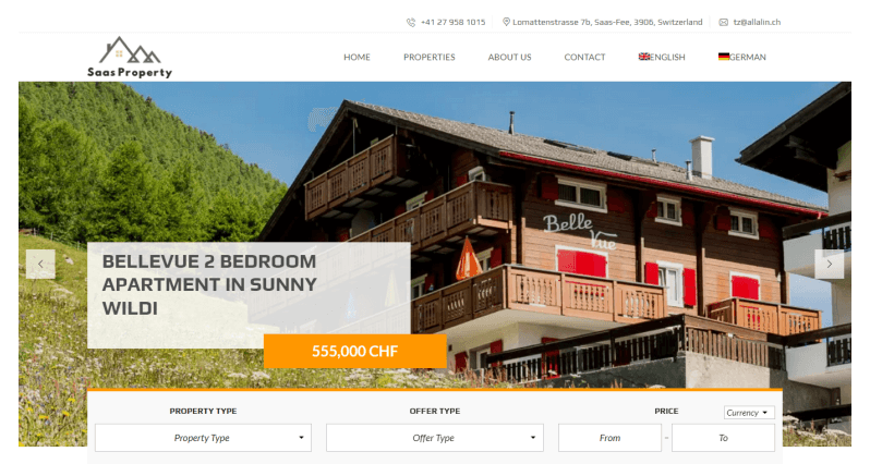
The best real estate website design leverages the brand’s credibility. Besides, it can unlock numerous opportunities.
Hence, Saas Property bears the marks of a brilliant marketing strategy. Thankfully, this Swiss realty site puts forward a good design concept. It taps into the idea of a better home search. Simple search fields deliver outstanding clients.
Total transparency defines them. Moreover, visitors directly access the landlords, brokers, and estate managers.
You can easily find the best apartment, house for rent, or sale is perfectly quick and easy with this website.
The navigation bar contains all the helpful information. So, the audience need not scrum around for anything.
it integrates the off-canvas menu and the sidebar menu. Moreover, other pages also look creative with a clean and minimal layout, aside from the homepage.
Never miss what we uncover here.
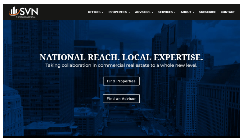
Chicago-based SVN gives a fulfilling website experience. First, the darker hero banner offers a compelling skywalk to the visitors through the Chicago skyline. It blows one’s mind right off the bat.
Their tactical use of dark shades and flashy white buttons manifest great messaging. Visitors find the homepage content absolutely captivating.
Look at the graphical presentation! They sufficiently point out where you need to focus while avoiding redundancy.
Moreover, the number chart firmly establishes credibility. Featured properties reveal through a slideshow the best real estate dealings in Chicago. Eye soothing!
Something new and game-changing spotted! SVN prominently places its Twitter handle for social users to engage in the future.
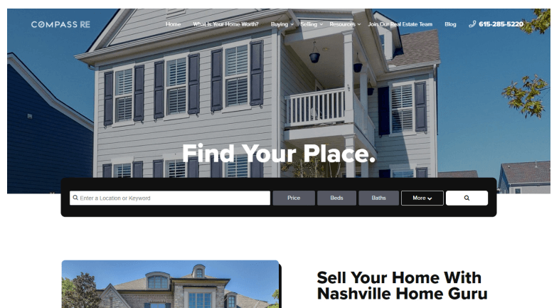
Nashville Home Guru portrays a fresh real estate website layout.
Whitespace concepts reach a whole new height. We find the elements nicely placed at specific gaps.
Also, the responsive elements claim your full concentration.
Interestingly, the navigation bar hides in plain sight. However, the scrolling cursor elegantly exposes it on a white backdrop.
Anyway, they stick to their original real estate identity with a prominent search bar on the hero banner.
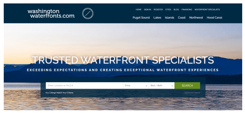
If you are a riverside or shoreline real estate agency, you must take a close at this best real estate website design.
A dreamy hero banner portrays the Washington coast side. The image makes one wonder what lies ahead.
Personality and creativity set it apart from other best property websites. Stunning websites can expand your realty business.
They emphasize trustworthiness and put the “MEET THE TEAM” and “TESTIMONIALS” sections at the top. Vivid, versatile colors really take after your soul.
Judicious use of space illustrates numerous projects. Visitors want to explore more. Thus, luxury living and affordable property management set a new record. Particularly, the blackish background intensifies the website’s elegance.
Conclusion
The property niche is exceptional. Typically, it focuses on gorgeous and appeasing elements. These top realty websites help you customize yours. Your target population deserves all preferences. So, keep them in mind.
Besides, long-term players pioneer fresh property website layouts. You can promote wonderful relationships with the clients via the best real estate website design.


